SUPERBOWL WEEK: Creation of an effective food advertisement
By Cece Cannata and Emaan Riaz,
Bluedevilhub.com Staff–
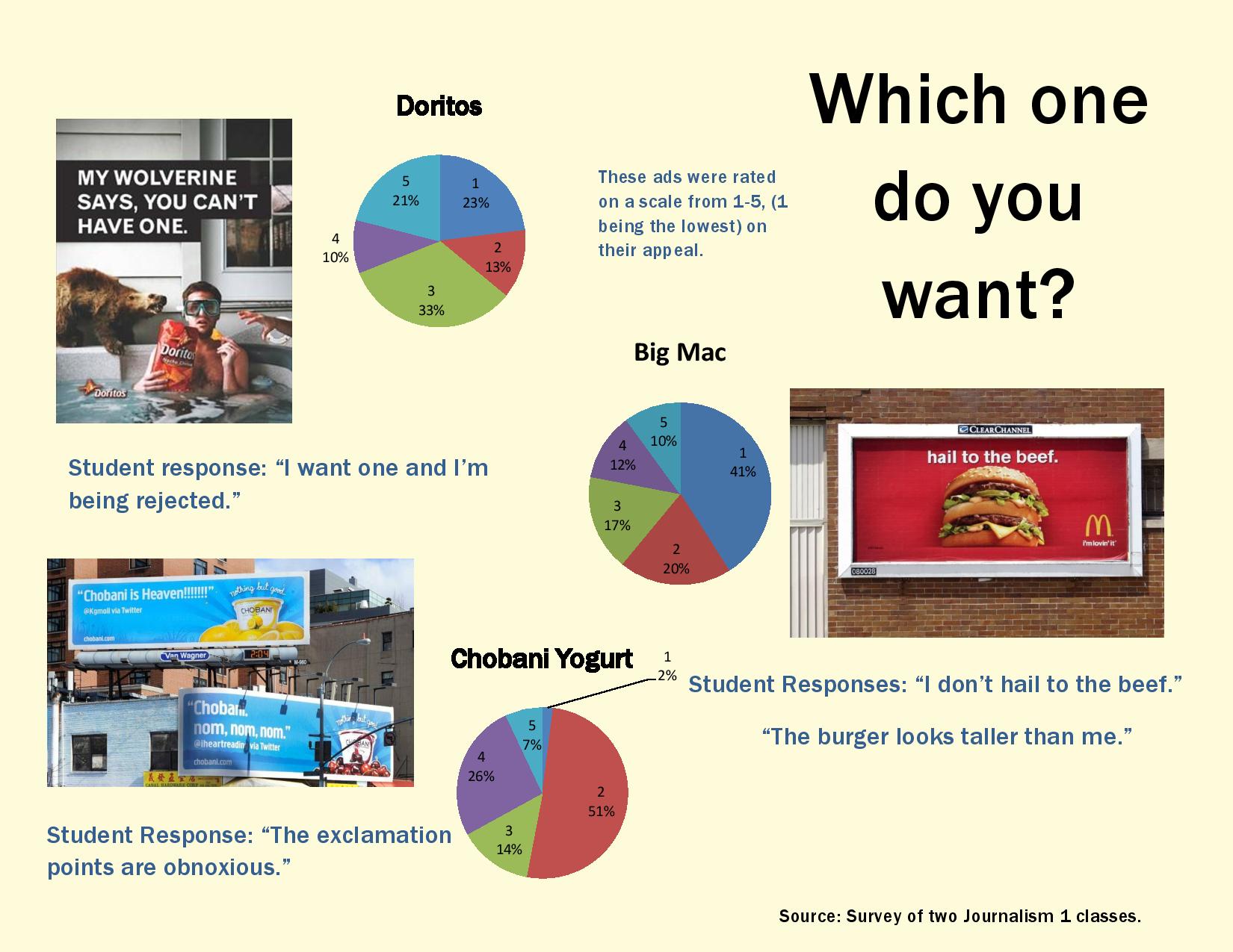
The McDonald’s billboard on the side of the highway is bright and flashy, and features a big, juicy burger. The crimson red and vibrant yellow colors pop, and your stomach growls. Every inch of the Big Mac looks delectable and mouthwatering.
The art of food advertising has been around for a while, and the main goal has always been to increase a business’s revenue. To accomplish that mission, ads must be successful in appealing to the audience.
Michelle Greenwald, a marketing and business professor at the University of Columbia, told Forbes magazine that in order for an advertisement to be effective, it must be memorable, able to deliver a personal message and represent values higher than the product itself.
Many marketing use an emotional hook to draw people in and associate the product with good feelings such as accomplishment, belonging and self-fulfillment.
These motivations change with each age group. For example, an advertisement that screams fun, cheerfulness and happiness is most likely directed towards children. An advertisement that centers on being popular and cool is directed more at teenagers.
Johnathan Stemmle, professor of Public Relations and Journalism at the University of Missouri notes that “the goal is to create those messages and appeal to get people to take a specific action.”
Although the effectiveness of an advertisement depends on the age group, the same basic principles apply to the creation of the ad.
It is actually a very scientific process. It starts out with establishing a main goal and knowing who the audience is, and then moves to conducting various forms of research, such as surveys, focus groups, interviews and comparing industry data.
After all the research has been completed, it’s time to design the ad itself.
Stemmle says Papa John’s advertisements are good examples of this process.
“So you’ve got groups like Papa John’s [that have] been using a celebrity spokesperson in their ads in the form of Denver Broncos quarterback, Payton Manning,” Stemmle said. “They’re doing that because their research must have shown that their core audience was men of a certain age who like Manning or would listen to him as a pitchman and take action to buy pizzas based on his appeal.”
Leo Burnett, an advertising executive and founder of Leo Burnett Worldwide, once said that “The secret of all effective advertising is not the creation of new and tricky words and pictures, but one of putting familiar words and pictures into new relationships.”
Many advertisers today rely on this piece of advice to help them create an influential ad.
However, sometimes words can be put together in the wrong way.
Sophomore Andrea Bray responded to a controversial Pretzel Thin ad from 2010 that used the slogan, “You can never be too thin.”
“I think that’s a really wrong thing to put on an advertisement when so many people are already suffering from eating disorders. It’s inappropriate, even if they are called Pretzel Thins,” Bray said.
One of the most important aspects of creating a powerful ad is color.
The Gorilla Ad Agency has divided up the color spectrum into a series of symbolization; for example, red represents excitement, passion and danger, while blue represents coolness, trust and reliability. Gold is used to show prestige, luxury and the elite, while green stands for freshness and abundance.
A company like Pepsi might use the color blue to convey the coolness of the drink, while many fast food chains tend to use brighter colors in their ads because they excite the taste buds.
“It makes it seem like the food will make me happy,” sophomore Joey Tan said.